Masami
To redesign Masami's Shopify website to increase sales and boost conversions, and enhance user satisfaction.
Role
UX Designer
UX Researcher
Played a key role in user research and analysis. Led the journey mapping and ideating stages, exploring multiple solutions.
Objective
To elevate Conversion Rate, Customer Satisfaction, and Brand's Value by optimizing designs for various devices.
Challenge
Customer conversion rate is less that 1% out of 3,000 monthly visitors.
Result
Redesigned 4 pages of site
-
25% rise in conversion rate
-
Customer satisfaction score increased
Tools
Figma
Notion
Team
5 HCDE Students
Duration
9 weeks


.png)
Research
WEBSITE EVALUATION
Before beginning the e-commerce site redesign, the team assessed the website’s initial impressions across key pages and documented the thoughts.
DATA ANALYSIS
By leveraging Shopify Partners, the team gained direct access to the company's Google analytics. This data revealed the most frequently visited sections of the website as well as where customers tended to drop off during the purchasing process enabling us to pinpoint areas requiring attention.
COMPETITOR ANALYSIS
A competitive analysis was conducted to grasp industry trends, pinpoint areas for enhancement, strategize, and benchmark performance, all with the aim of making well-informed decisions to improve Masami's website.


CUSTOMER SURVEY
We gathered a combined total of 18 surveys from both loyal and potential customers.


Synthesis
Landing Page
-
Unorganized IA and confusing nav bar nomenclature
-
Inconsistent content hierarchy and alignment
-
Missing primary CTA fails to guide users toward key actions.
-
Cluttered layout leads to high drop-off rates.
-
Lack of clear brand identity and value proposition affects trust.
Product Page
-
Lack of information on the brand and products.
-
No well-defined product categories.
-
Separate page for each product size, creating frustration.
Collections Page
-
Well-defined and functional filters are missing.
-
No labels like "Back in stock" and "Most Purchased," missing the opportunity to communicate demand.
Based on the research and insights gathered, and considering the constraints of a nine-week project cycle, the team decided to focus on redesigning 4 primary pages:
Landing Page, Product Page, Collections Page, and Cart Page.
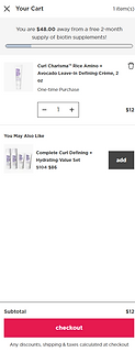
Cart Page
-
Rewards and recommendations are missing.
-
Missing "Other Items You Might Like" section
-
No "Continue Shopping" button in the checkout page.
-
No Clear payment options
-
My Account section is missing, customer history can't be tracked.
Ideation
MOODBOARD
Together with the client, the team curated a mood board to establish a clearer direction for the new visuals, functions, and layout of the project.
JOURNEY MAPS
Developed journey maps for two user personas: These maps were instrumental in evaluating and refining the existing Masami website, providing us with a clear vision for optimization.
A loyal, acquainted customer.


A new customer

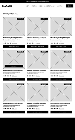
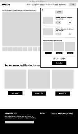
LOW-FI WIREFRAMES
The team concentrated on exploring various page layouts and experimenting with new functionalities.


Prototype
FINAL DESIGNS
After receiving feedback from the client on our wireframes, we refined and finalized the new designs, incorporating branding elements and creating prototypes.
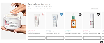
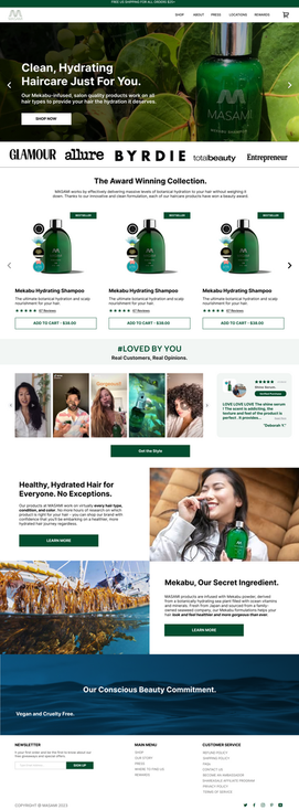
LANDING PAGE
With MASAMI's unique, award-winning hydrating products, you simply must have them. Start shopping now!
COLLECTIONS PAGE
Ready to make a purchase? Easily add items from the collections page directly to your cart.

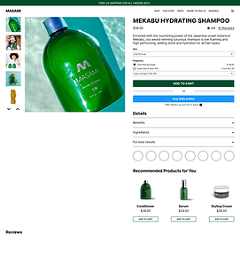
PRODUCT PAGE
All essential information at a glance: price, star rating, description, and available sizes. For further details, simply expand the collapsible menu.
CART PAGE
Keep browsing seamlessly even after viewing your cart, without interruptions from loading new pages.

LANDING PAGE : Details


Hero Image improved, giving clear idea of the website
CTA added encouraging users to shop
Names and hierarchy of nav items fixed
Prominent section of top products allowing immediate "add to cart" option
Clear tags of bestseller products
Carousel to view additional products
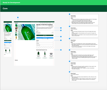
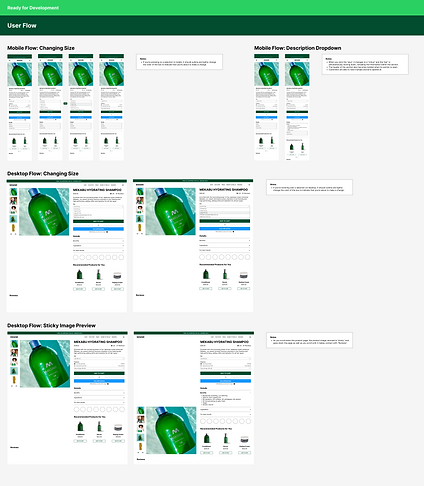
HANDOFF
We created comprehensive documentation outlining the designs, ensuring they are prepared for handover to the development team that the client may engage in the future.
Reflection
KEY LEARNINGS
Website Performance & User Retention
Ensuring optimal website performance and a seamless browsing experience are essential for retaining users and minimizing bounce rates.
User Feedback & Data Analysis
Gathering ongoing feedback from users and analyzing data from generated analytics provide valuable insights for iterating and enhancing design.
Product Discovery Features
Implementing effective product discovery features—such as search functionality, filters, sorting options, and personalized recommendations—helps users navigate a website optimally.
Checkout Process Simplification
Simplifying the checkout process is necessary as much as possible to reduce friction and increase conversion rates.
NEXT STEPS
Design changes will be gradually implemented by the co-founders or with developer support on Shopify.
The team plans to distribute a post-survey to initial participants after implementation to assess impact.
The client supports the survey plan and will provide follow-up opportunities.
The team aims to measure improvement from the previous 3.88 rating (on a 1-5 scale).


